I’ve gone through the levers as I have them set and included examples of the various fonts Continental offered.
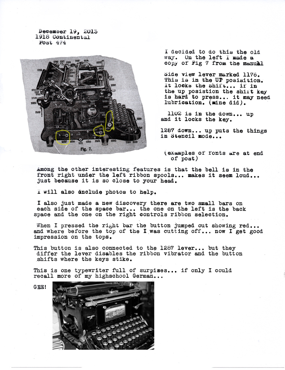
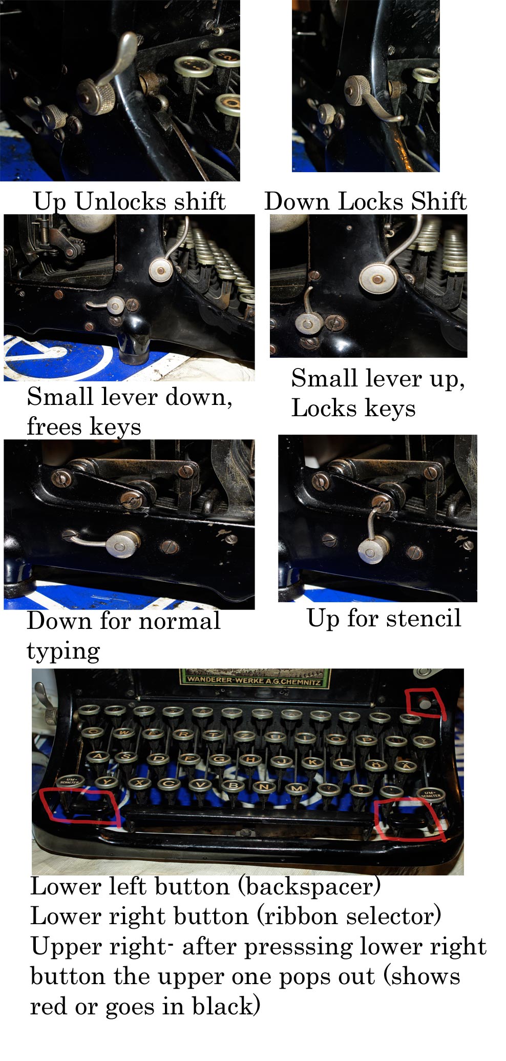
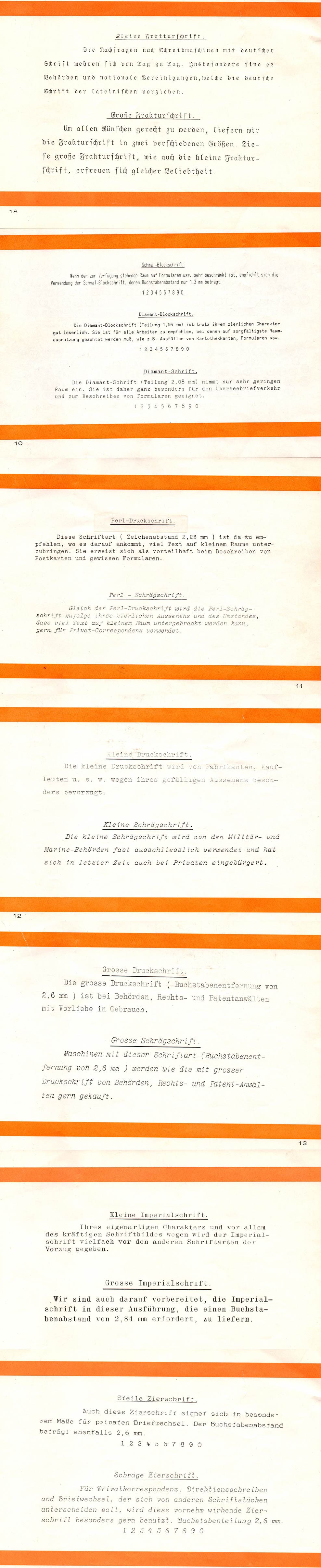
I’ve gone through the levers as I have them set and included examples of the various fonts Continental offered.
Copyright © 2024 www.typeoh.net. All Rights Reserved. Premium WP Plugin
The scans of the typefaces are fantastic! I didn’t know that so many typefaces were offered by any company as early as 1918. I’ve seen the last one, Schräge Zierschrift, before, but the one I’d love to find most on a Continental portable is Steile Zierschrift.
Thanks for posting about “The Continental”. Very elegant typefaces. “..beautiful music, dangerous rhythm!”
Very interesting. It seems to have excellent alignment even after all these years — a sign of great engineering.
I love both versions of the Zierschrift!
THANK YOU so much! I have a Continental Wanderer for almost a year and could not find any information on it… Now I know it’s Schräge Zierschrift!