It looks nice… oh so pretty… but it may take a while for me to warm up to machine.
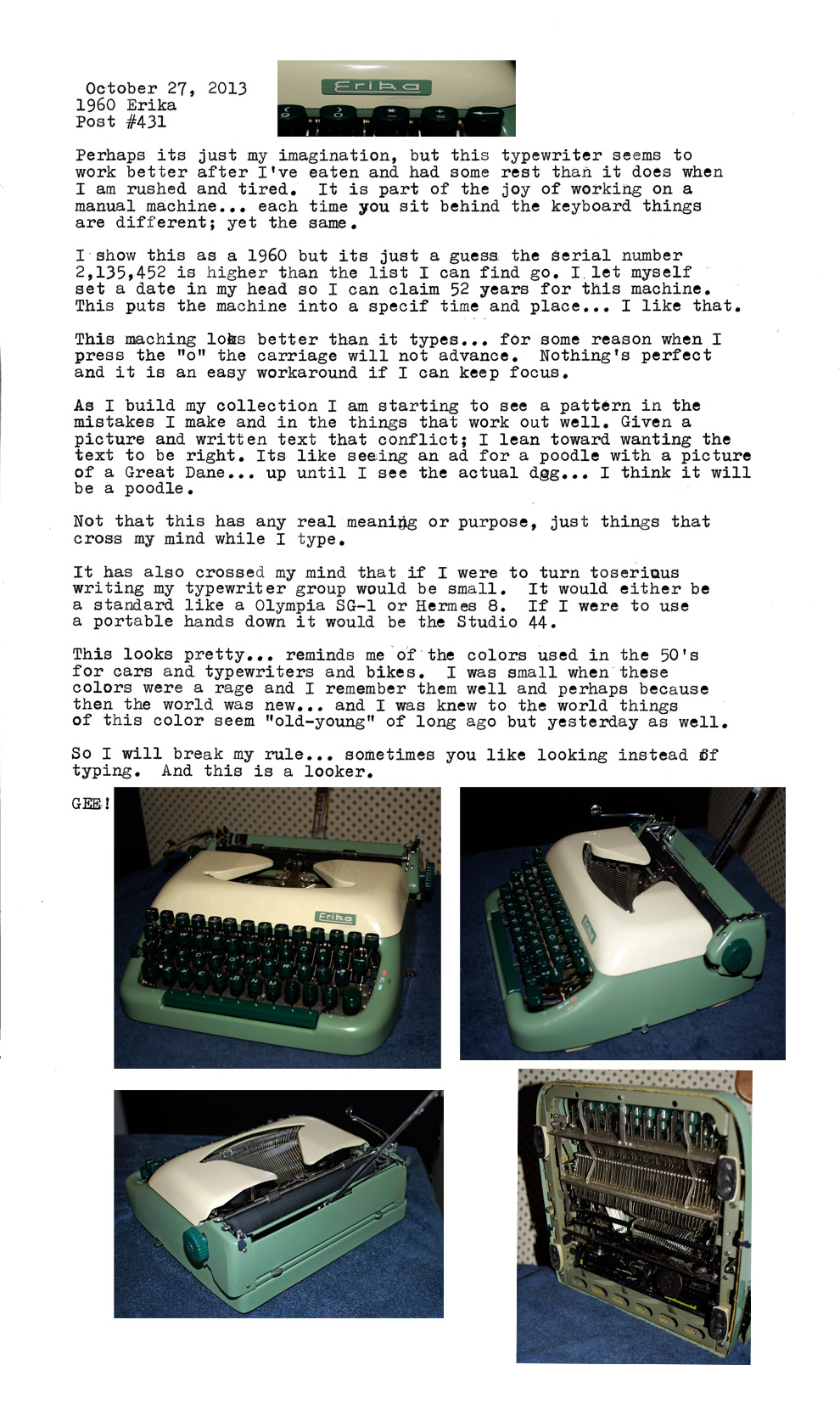
Two Tone Erika 1960 (best guess)
8 thoughts on “1960 Erika… 10 on looks… 4 on performance.”
A very nice looking machine; my feeling about how these feel to type on parallels yours. They look nice – so we wish they were nice. Maybe even give them a bit of extra credit. It isn’t like the Everest K2 which is both ugly and possessed of a feel in typing much like smacking a large, dead fish on a butcher’s table… I mean, for a typewriter like that, there’s just no excuse possible. At least the Erika pleases when parked.
A nice look, and happy 1950’s pastel colors. I had a 1952 Plymouth Cranbrook of that color, and rounded body style as well. It was still going strong when I married in 1966 when we replaced the worn gray seat covers and headliner with coordinating pastels. Happy colors for a happy time.
A very nice looking machine; my feeling about how these feel to type on parallels yours. They look nice – so we wish they were nice. Maybe even give them a bit of extra credit. It isn’t like the Everest K2 which is both ugly and possessed of a feel in typing much like smacking a large, dead fish on a butcher’s table… I mean, for a typewriter like that, there’s just no excuse possible. At least the Erika pleases when parked.
I consider the Everest to be a machine of dignity.
They’re great-looking typewriters with lots of features, yet … somehow … not quite satisfying.
I want an Erika M, the deluxe prewar version with e x t e n d e d s p a c i n g and other nice perks — I’ve tried one and it feels great.
The better they look… the harder it is to take that it types poorly.
It really is a looker! I’m a sucker for the two-tone thing. It’s a shame it’s not as nice to use.
You’re right though – quirks are what make them endearing.
The Erik is quite a quirk.
A nice look, and happy 1950’s pastel colors. I had a 1952 Plymouth Cranbrook of that color, and rounded body style as well. It was still going strong when I married in 1966 when we replaced the worn gray seat covers and headliner with coordinating pastels. Happy colors for a happy time.
My father had a 57 Ford Fairlane… two tone. Near me its a 1955 Ford with the two tones that match this typewriter.